Development Bank of Wales
The details
Duration
22 Weeks
Area
15,600 sqft
The Brief
The Solution
Even before we were all forced out of our offices by the pandemic, Development Bank of Wales had a vision to encourage their teams to spend more of their time working from home. With the office becoming less a place to commute to everyday and more a creative space to come together and collaborate.
Making the most of space was central to this vision. Having previously occupied three floors, the business was consolidating down to just two. Our job was to make sure that every inch of this reduced square footage was used effectively.
The project was kicked off with a highly involved piece of Workspace Analysis which helped us better understand the operational needs of both the business as well as the individuals within it.
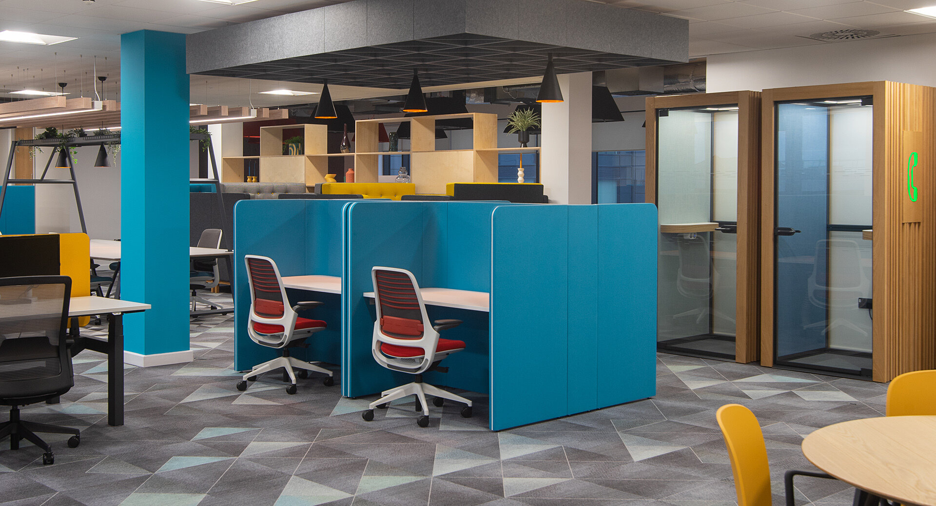
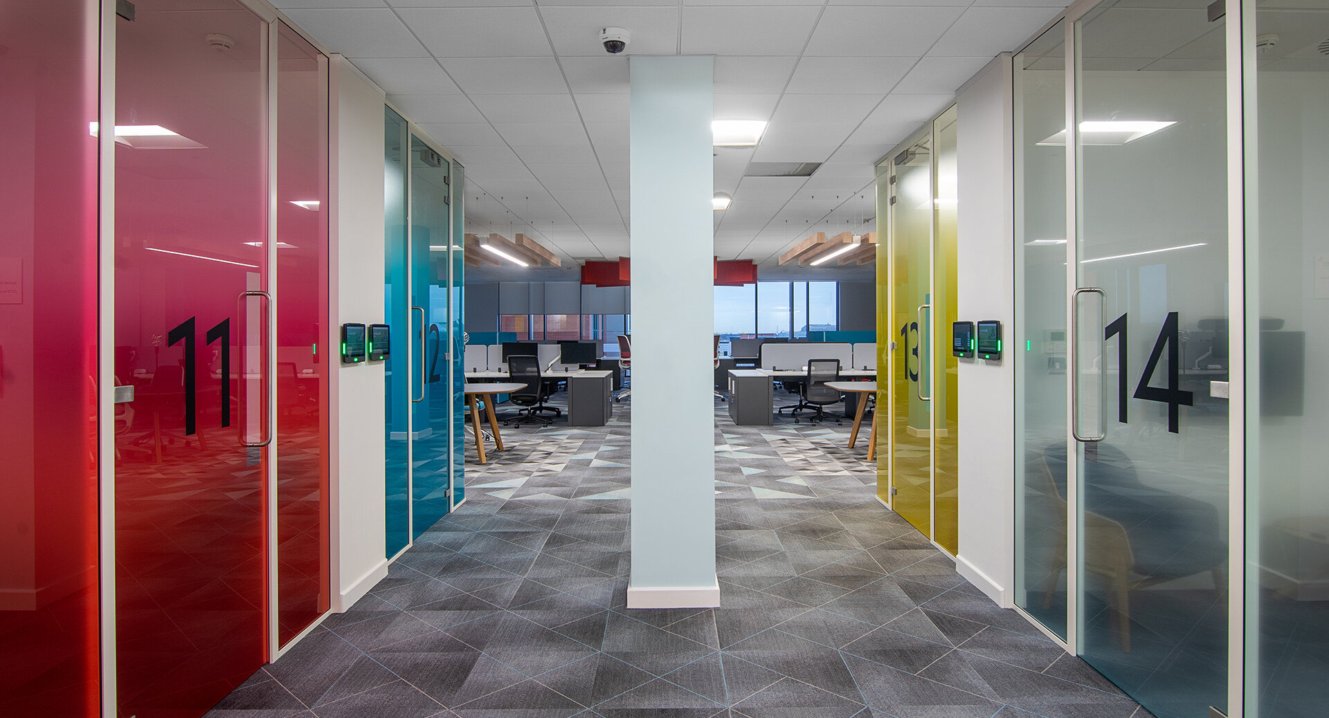
From this we established that there was a need to introduce greater flexibility into the space, enabling areas to be both adaptable and multi-use. This was particularly true of meeting spaces which had historically been fairly regimented and separate from the main working environment. What we have created are meeting spaces which can adapt to the many and varied ways the team need and want to meet.
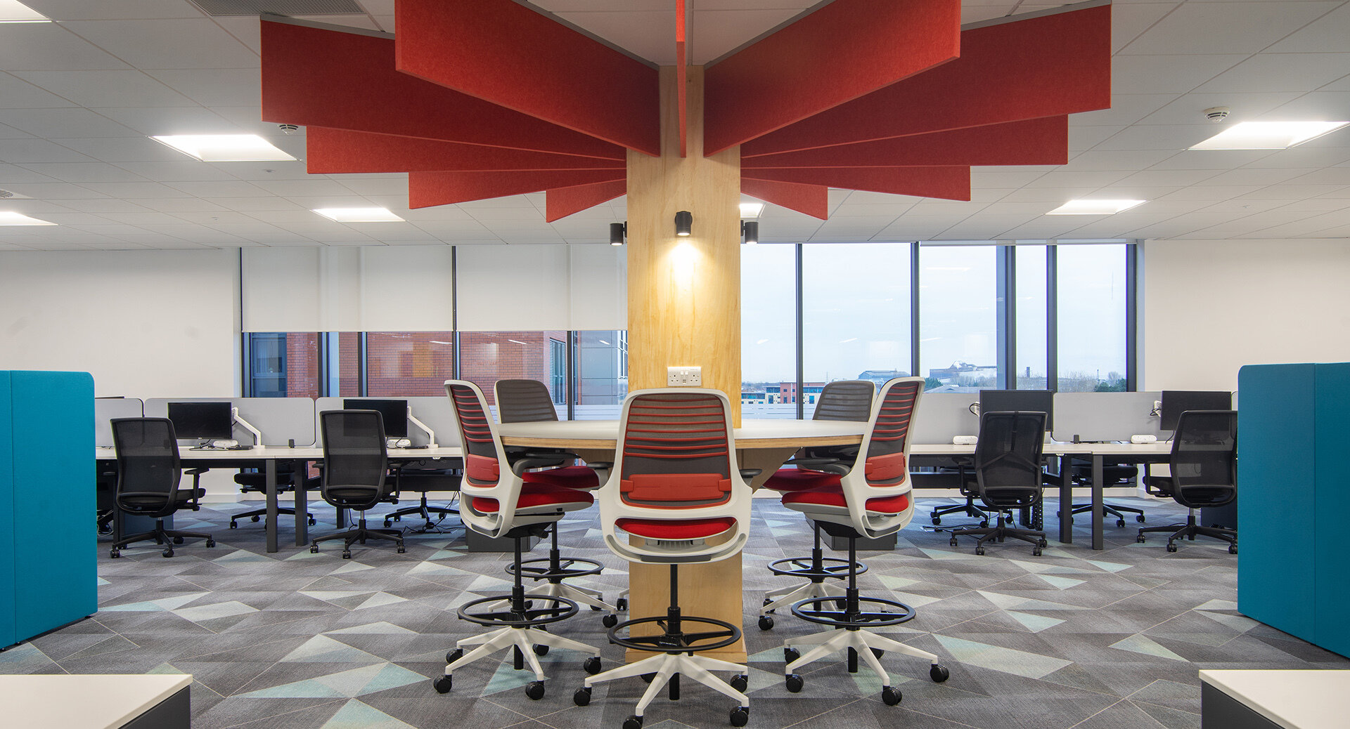
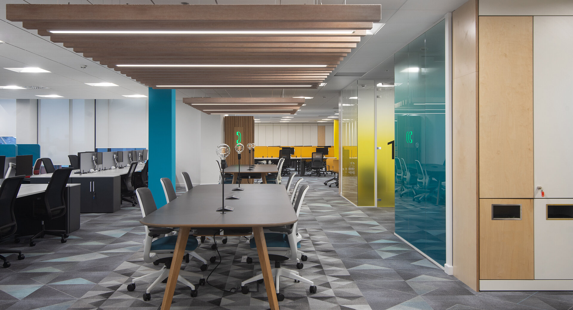
Key to the vision was to create an environment which would bring people together and nurture a greater sense of community. To deliver this our design blended modern, commercial styling with warmer, residential features.
Rather than branding the space too overtly, brand colours were cleverly woven into the fabric of the overall design, creating a more subtle and natural ‘on brand’ look and feel.
Where possible, we looked to reuse and recycle elements from the existing space. A large number of glazed doors and frames were reused from the old 7th floor meeting space in the newly configured Visitor Suite. Walnut MFC tables, leather meeting room seating and credenza style storage was also reused and repurposed. Whilst the existing suspended grid and mineral fibre tile ceiling remained in situ in all open plan office areas with existing light fittings replaced with energy efficient LED modules.
